


Abakus Direct Furniture sells furniture in the highly competitive UK market. The store had a broad catalogue and a recognisable offer, but its visual language increasingly positioned the brand in the budget segment. At the same time, the existing PWA frontend was heavy, slow and difficult to develop.
Between January and June 2025, I redesigned the Magento 2 frontend. The project combined a new visual direction, clearer purchase journeys and a technically lighter storefront. Two months after the new version launched, the number of orders was 47% higher.
- Client
- Abakus Direct Furniture
- Scope
- UX/UI and Magento 2 frontend
- Result
- 47% more orders
The starting point and project goal
The previous store no longer reflected the quality of the products or the ambition of the business. Its strong association with low prices made it harder to present more elegant collections and build confidence around higher-value purchases.
The problem was not limited to presentation. The extensive PWA solution was slow, increased the cost of change and made day-to-day development unnecessarily difficult. We needed to improve the brand experience without rebuilding the entire Magento platform and every integration from scratch.

From a budget store to a more premium brand
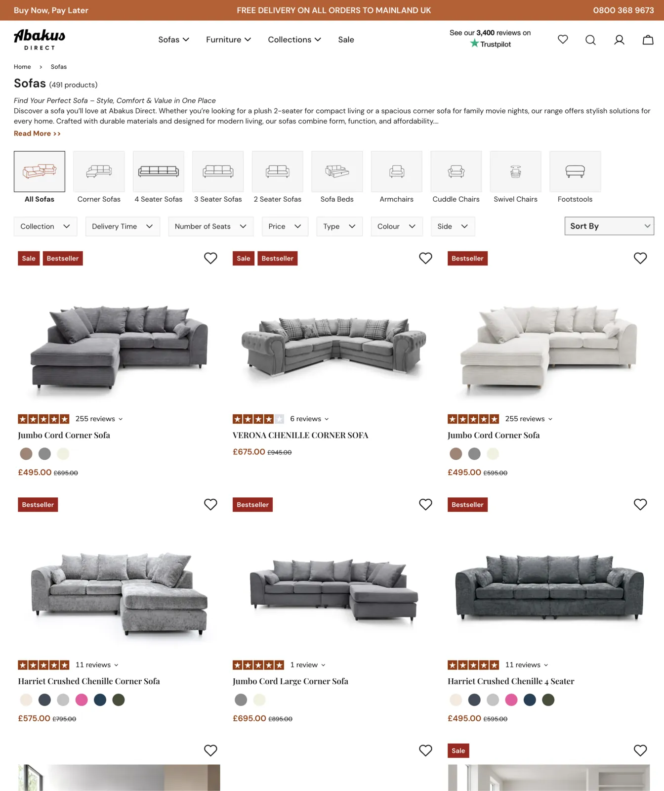
The new UX/UI design was created by Bartosz Doryń. The direction took inspiration from well-structured British interiors retailers: more breathing room, calmer typography, larger product imagery and a clearer information hierarchy. It needed to feel more elegant while still giving customers a short, practical route to purchase.
The redesign covered the complete journey rather than just the homepage. We reorganised category listings, product options, delivery information, trust elements, the mini basket and checkout. The new brand character therefore stayed consistent at the points where customers make buying decisions.
The Magento 2 implementation approach
The store retained its existing Magento 2 and Luma foundation, while the storefront was rebuilt using a lighter approach inspired by Hyvä. I used Tailwind CSS and Alpine.js, reducing the amount of JavaScript required for common interactions.
This preserved compatibility with established modules and business processes while removing part of the overhead created by the previous frontend. Rather than funding a high-risk rewrite of everything at once, the business could focus investment on the areas customers actually see and use.
The key technical decision: improve storefront speed and quality without unnecessarily rewriting stable Magento 2 business logic.

Product page, mini basket and checkout
A furniture product page needs to hold a lot of information without overwhelming the customer. Options, dimensions, colours, availability and delivery details were reorganised so that essential decisions could be made without searching through the entire page.
The mini basket gained a clear product and order summary. Customers can confirm their selection quickly and proceed to checkout without unnecessary intermediate screens.

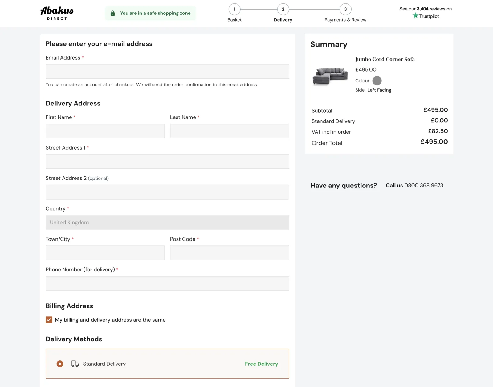
The checkout was simplified visually and divided into clear sections. Forms, delivery choices and the cost summary follow a logical order on desktop and mobile.
The result after launch
more orders within two months of launching the redesigned store.
The redesign gave the brand a more premium character, while the lighter frontend improved the shopping experience. Most importantly, the project did not stop at visual polish—it translated into a measurable increase in orders.
I particularly valued Artur’s professional and fast communication, reliable delivery and innovative approach to technical challenges. I would definitely recommend APK Studio to ecommerce business owners.
Wiktor Laskowski, owner of Abakus Direct Furniture
What does this project demonstrate?
- A redesign should support brand positioning. A new look matters when it helps the business reach the right customers and communicate the value of its offer.
- Not every store needs a complete rewrite. A carefully chosen hybrid approach can reduce risk, preserve compatibility and shorten delivery.
- UX and technology need to work together. Attractive screens are not enough when the product page, basket or checkout remains slow and confusing.
- Results should be measured after launch. For this project, the key metric was the number of orders rather than an opinion about the new visual design.
If your Magento 2 store looks older than the products it sells, or a heavy frontend is slowing down development, a focused audit is a sensible first step. It will show whether you need a full Hyvä implementation, a redesign of the current solution or an incremental improvement of the most important journeys.